LOGO
DESIGN PROPOSAL |
|
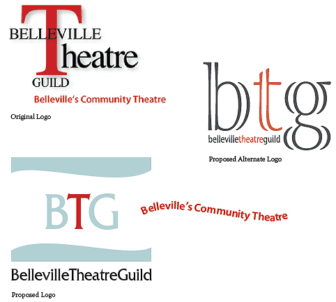
| The Challenge: To re-design the Belleville Theatre Guild logo and give it a modern look. It is part of a total remake of the guild’s image |
|
| Method: | |
| • | The colours and shapes reflect the overall look of other projects I designed for them. The altenate proposed logo is included as a choice. |
| • | The shapes were created and the path-finder tool used to cut the wave into the coloured block. |
| • | The typeface was updated (Fritz Quadrata) so that it retained the serif of the originao, but much reduced in size. |
| • | The typeface was updated (Fritz Quadrata) so that it retained the serif of the original, but much reduced in size. |
| • | The tagline was set to the wave path, and offset to the right for a whimsical treatment — it can be postitioned below the company name for a more formal look. |
